Why the shape of the curve matters more than the total carbs
Two Thursdays ago, Audrey had apple slices and a small glass of apple juice after school. About 40 grams of carbs total. Her CGM drew a nearly vertical line straight up. We were chasing it for an hour.
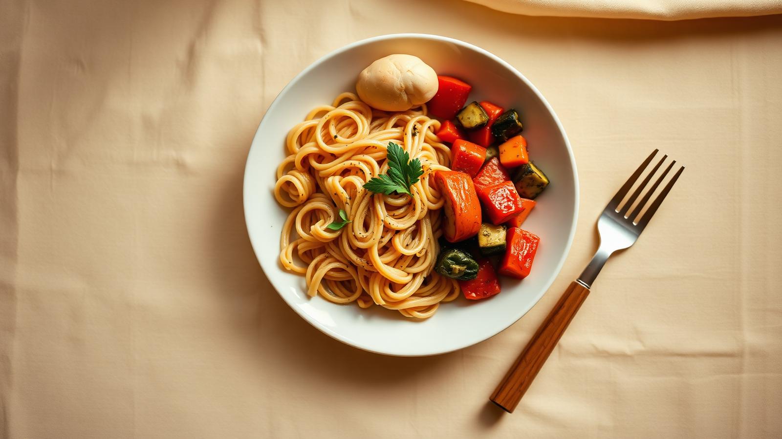
The Thursday before that, she had pasta with a little butter and parmesan. Also roughly 40 grams of carbs. Her line climbed slowly, plateaued, then — two and a half hours later — crept back up again. Different kind of chase.
Same number on the label. Two completely different nights.
I kept staring at those CGM graphs trying to understand what I was actually looking at. I knew carb counting mattered. Our team at the Barbara Davis Center had taught us that from day one, back when Audrey was five and we were still learning what a bolus even was. But clearly the number alone wasn't the whole story.
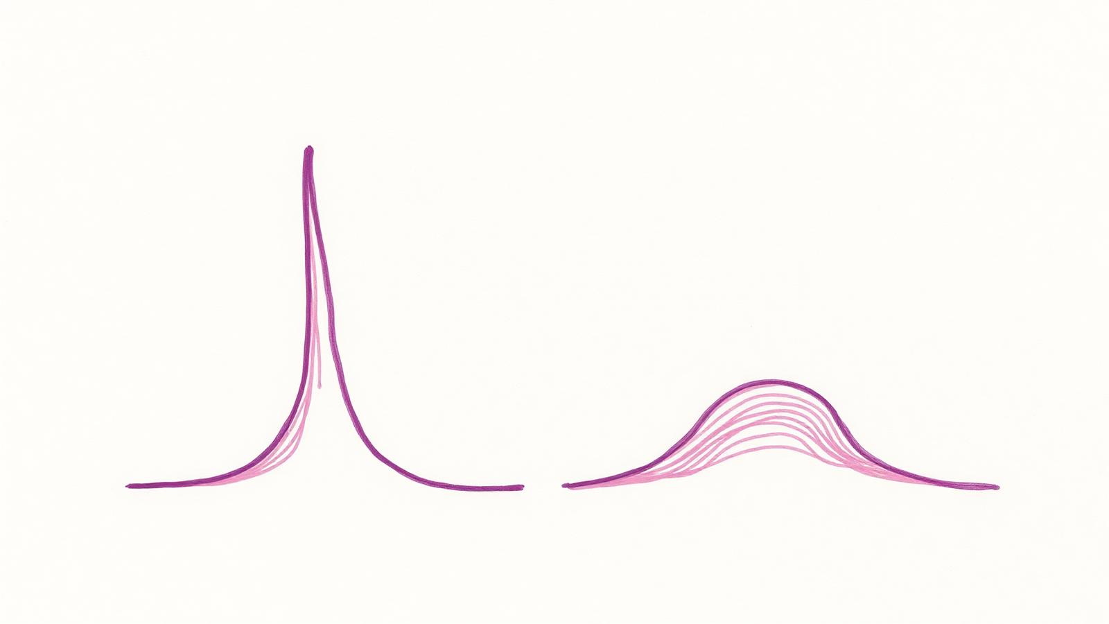
What I was really looking at was the shape of the curve.
The number is a starting point, not the answer
Carbohydrate counting works. It's the foundation of mealtime insulin management for kids with T1D. But carbs convert to glucose at very different speeds depending on what else is in the food — and that speed is everything.
This is where glycemic index comes in. Glycemic index (GI) is basically a ranking of how fast a food raises blood sugar compared to pure glucose. High-GI foods — white bread, juice, rice cakes — spike fast. Low-GI foods — lentils, most whole fruits, pasta — climb more slowly.
But GI alone doesn't tell the whole story either. Glycemic load (GL) layers in how much of a food you're actually eating. A watermelon slice has a high GI but a modest glycemic load because it's mostly water. A big bowl of white rice has both a high GI and a high GL — and you'll feel that on the CGM.
Neither number captures what happens when you mix foods together. And that's where it gets complicated — and interesting.
Fat is a time-release mechanism
Pizza night is famous in T1D circles. Not in a good way.
The carbs in pizza crust hit reasonably fast. But the fat in the cheese and the oils slows gastric emptying — meaning food literally moves out of the stomach more slowly. So instead of one clean spike, you get a smaller initial rise, followed hours later by a second, sometimes larger one. Families call it the pizza double-spike. Researchers call it delayed postprandial hyperglycemia. Either way, it is deeply annoying at 2 a.m.
Ice cream does something similar. The fat content means the sugar doesn't hit all at once. You might handle the first hour fine. Then, well after the meal has faded from memory, the curve starts climbing again.
Published work on dietary fat and T1D has confirmed what parents have known from experience: fat significantly delays and prolongs the glucose response in ways that carb counting alone doesn't predict. High-fat meals can require very different management strategies than low-fat meals with identical carb counts.
Always talk to your care team about how your child's specific regimen handles these situations. This is not dosing advice — it's just an explanation of what you're actually seeing on that CGM graph.
Protein adds a delayed bump
Protein is quieter about it, but it shows up eventually.
Large amounts of protein — think a big serving of chicken, a burger, a high-protein snack bar — can convert to glucose through a process called gluconeogenesis. It doesn't happen fast. It happens 2 to 4 hours after the meal, and the rise is slower and lower than what carbs produce. But it's real, and it shows up on CGMs in ways that can confuse parents who've already "accounted for" the meal.
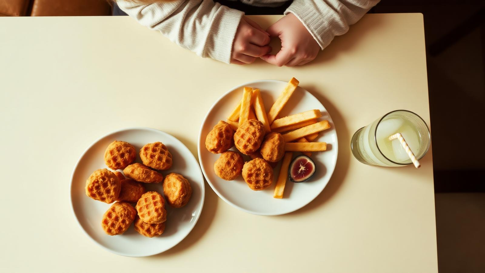
The practical upshot: a grilled cheese sandwich (moderate fat, moderate protein, moderate carb) tells a very different glucose story than 40 grams of glucose tabs. The total carb count might be similar. The curve will not be.
Fiber slows everything down (in a good way)
Fiber is the underrated player here. It's a carbohydrate, but it doesn't digest into glucose. More importantly, it slows the digestion of everything else around it — flattening the curve, smoothing out the peak, extending the rise over a longer window.
This is why a whole apple hits differently than apple juice, even though the carb counts can look similar. The apple has fiber. The juice is essentially fast sugar with the fiber stripped out. That's the apple-vs-juice gap Audrey and I experienced firsthand.
It's also why a piece of sprouted grain bread with almond butter produces a gentler slope than a plain white roll — even at the same gram count. The fiber and fat together reshape the whole response.
What this means in real life
None of this makes carb counting obsolete. It's still the foundation. But it does mean a few practical things worth keeping in mind — again, always in conversation with your care team:
- Snack composition matters. A handful of crackers before soccer sends glucose climbing fast. A small apple with peanut butter climbs more slowly and sustains longer. Same pre-activity goal, different curves.
- High-fat meals require longer watch windows. If the CGM looks fine at the 90-minute mark after pizza, that doesn't mean the night is over. The second wave may still be coming.
- Restaurant meals are particularly tricky. You don't know how much butter is in the sauce, how thick the crust really is, or whether the "grilled" chicken was finished in oil. We wrote more about navigating that in eating out with a T1D kid.
- Exercise timing adds another layer. Activity lowers blood sugar — but when you exercise relative to the curve matters. A high-fat meal before an afternoon sport can mean a delayed spike lands right as the activity-driven drop is also happening. Or not. Bodies are complicated.
My wife, who spent years as a nurse before T1D turned her into an overnight endocrinology student, put it simply: "The number tells you how much. The curve tells you what's actually going to happen."
She's right. And once you start seeing it that way, you can't unsee it.
Why CarbCue shows a curve, not just a number
This is exactly the problem we're trying to solve with CarbCue.
When you snap a photo of a meal, CarbCue doesn't just return a carb count. It looks at what's on the plate — the fat content, the fiber, the protein, the mix — and shows you an illustrative glucose curve. Not a flat number. A shape.
That shape is what actually determines how the next two to four hours go for your kid. A fast steep spike. A slow rolling climb. A delayed second wave. Each one looks different on a CGM, and each one may call for a different approach — one that you work out with your care team, not an app.
What the app can do is give you better information faster. So you walk into the meal with your eyes open, not just armed with a number and hoping for the best.
We built this because of nights like those two Thursdays. Because 40 grams isn't always 40 grams. Because a number without context is just a number. If you want to see how it works, take a look here — and if you're curious how CarbCue reads a meal in the first place, we go deep on that in how carb estimation from a photo actually works.
No launch date yet. Just a dad in Colorado, a lot of CGM screenshots, and a determination to make this a little less hard.
✦ Get CarbCue at launch
Join the iOS waitlist
We're building CarbCue for families like ours. Drop your email and we'll let you know the moment it's on the App Store.